


A new generation of the NLP Lab is now available: the Generative AI Lab. Check details here https://www.johnsnowlabs.com/nlp-lab/
The Analytics feature offered by John Snow Labs Annotation Lab enables critical analysis of the annotation projects and gives important hints on ways to improve the quality of the annotations.
Three types of Analytics are currently offered at project level:
- Tasks – includes different charts showing the overall annotation progress across the team,
- Team Productivity – shows a comparison of productivity across team,
- Inter-Annotator Agreement – highlights the level of agreement between different annotators working on the same tasks or on the same project.
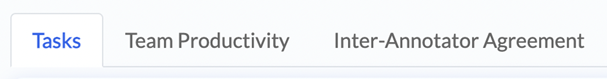
The three main tabs of JSL Annotation Lab Analytics (v. 3.4.0)
This article is the first on a series of blog posts that will introduce users to the available analytics and their specific case-based practice. We focus here on the Tasks analytics that give detailed information regarding tasks and their statuses, an annotation summary per user as well as several label frequency charts.
Project Status at a Glance
The first four charts provide information regarding the total number of tasks (Total Tasks) and also the number of tasks added in the last 30 days. A color-intuitive Tasks by Status chart illustrates percentages of tasks that are in progress, incomplete, submitted or reviewed. Information on the user that created/imported the tasks is given in the fourth chart.
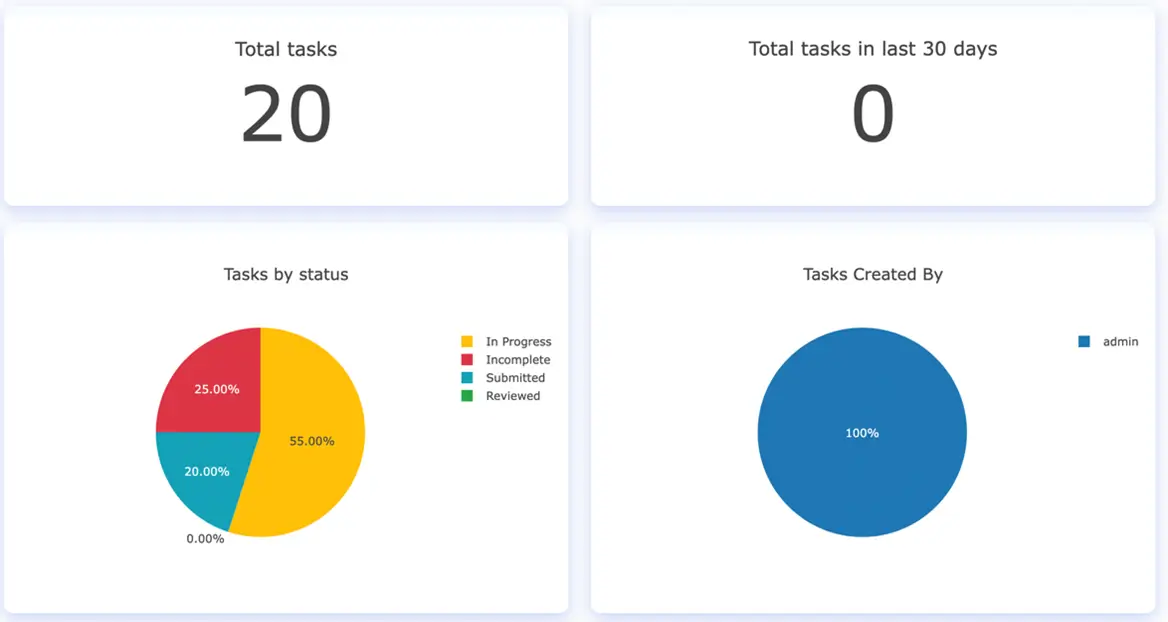
General tasks related data and charts (v. 3.4.0)
Combined, these general tasks-related analytics help the Manager to properly track the overall work progress of his team.
Annotator Summary chart describes the annotation progress for each annotator tool involved in the project: the number of incomplete, submitted, in progress, reviewed or “to correct” tasks.

Annotator Summary Chart (v. 3.4.0)
Label frequency charts
The Total Label Frequency Across Completions chart shows the total count (frequency) of a specific label from the project’s taxonomy. Labels with higher counts feed the model with a high number of positive examples thus the model will probably show better performance when identifying those. A low count for a specific label says the training data does not contain enough examples for that label thus one could expect the model to perform poorly when predicting it. To deal with those cases the Manager should either add more tasks that better cover the low-frequency labels or remove, split or merge those labels to other ones in the taxonomy. The orange dot indicates the minimum frequency count of a label while the green dot highlights the most frequent one.
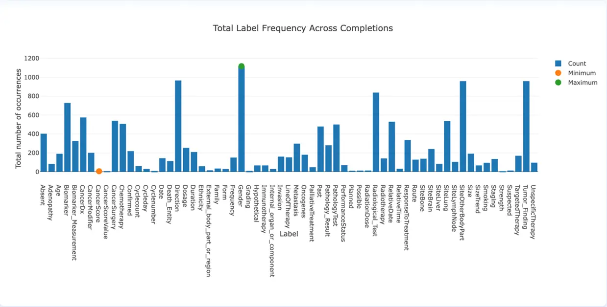
Total Label Count Across all Completions (v. 3.4.0)
To analyze the average number of occurrences of a specific label through the entire set of tasks we introduced the Average Label Frequency per Completion chart. This shows the overall distribution of entities at completion level and gives some valuable indication on what to expect in terms of preannotation at task level.
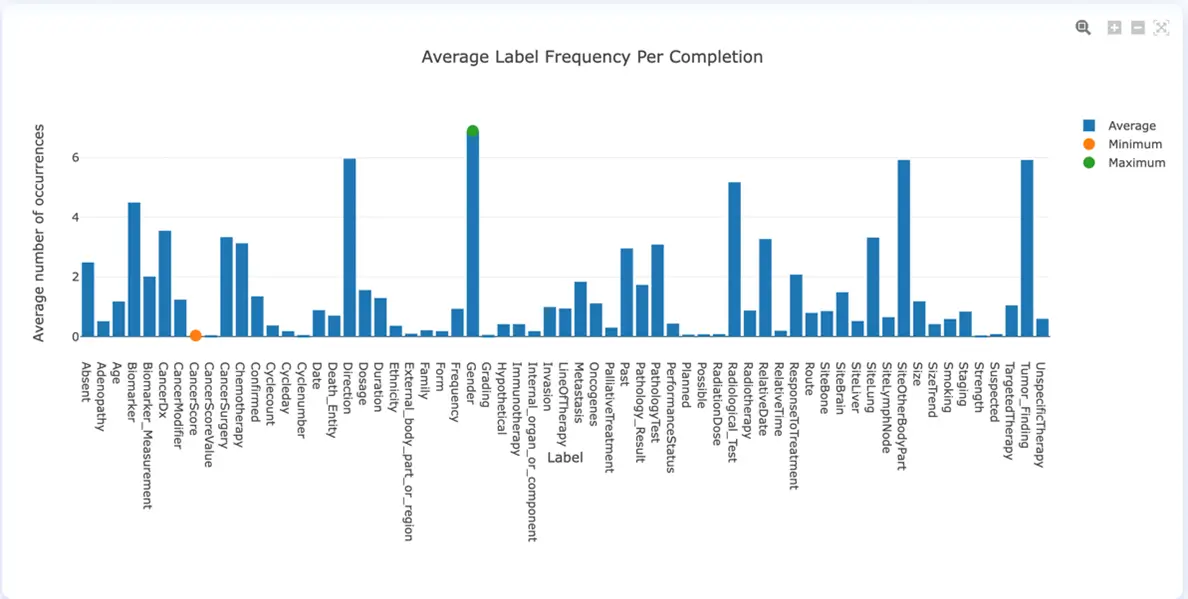
Average Label Frequency per Completion (v. 3.4.0)
Label Frequency by Annotator shows how often each annotator identified a given label in the current project. This chart combined with the task assignment information offer a clue on labels that might be overlooked by certain annotators. A drop down menu on the right upper corner enables the navigation between the taxonomy labels.
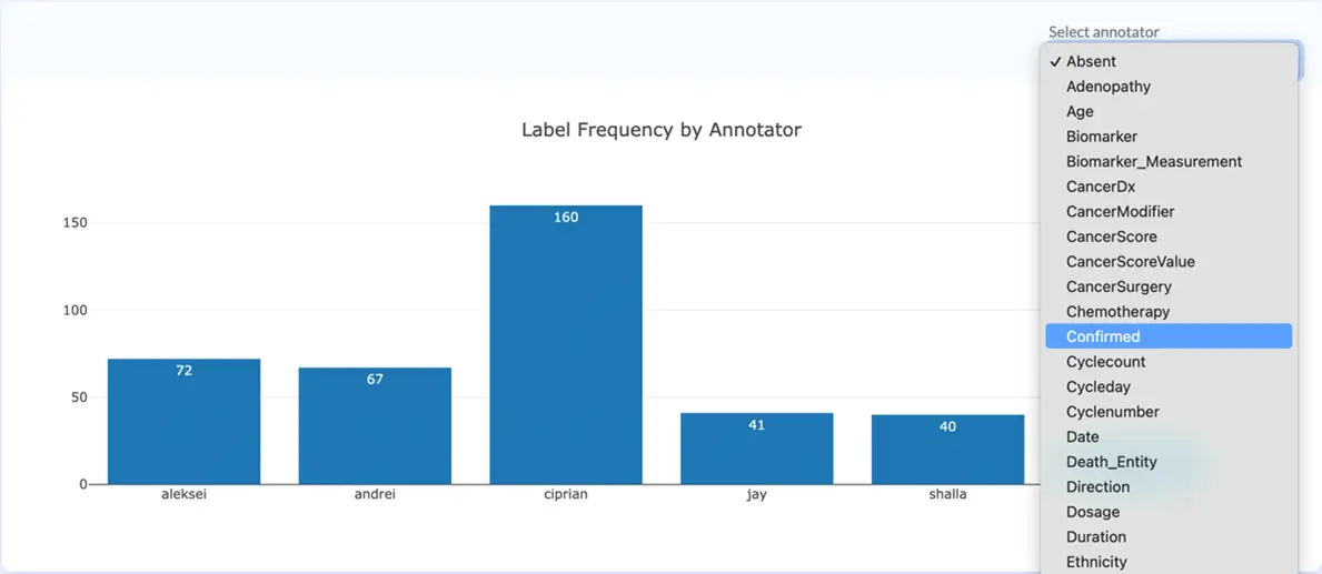
Label Frequency by Annotator with dropdown selections (v. 3.4.0)
Label variability
The Total vs. Distinct Values by Label Across Completions chart compares the total number of occurrences of each label across the tasks with the number of distinct values. This gives a good indication of the variability for each label across the project. If the orange and the blue bars of an entity have similar heights, it means that there is high variability. If the blue bar is much shorter than the orange one, it means that the variability is low. Low variability for a label usually means the project includes a very similar set of examples for that label. A model trained on this type of dataset will behave very well when preannotating similar documents but might have accuracy problems when analyzing documents containing alternative wording (synonyms) for that label. A higher variability means the model will see a larger palette of examples for the entity which will allow for a better generalization.
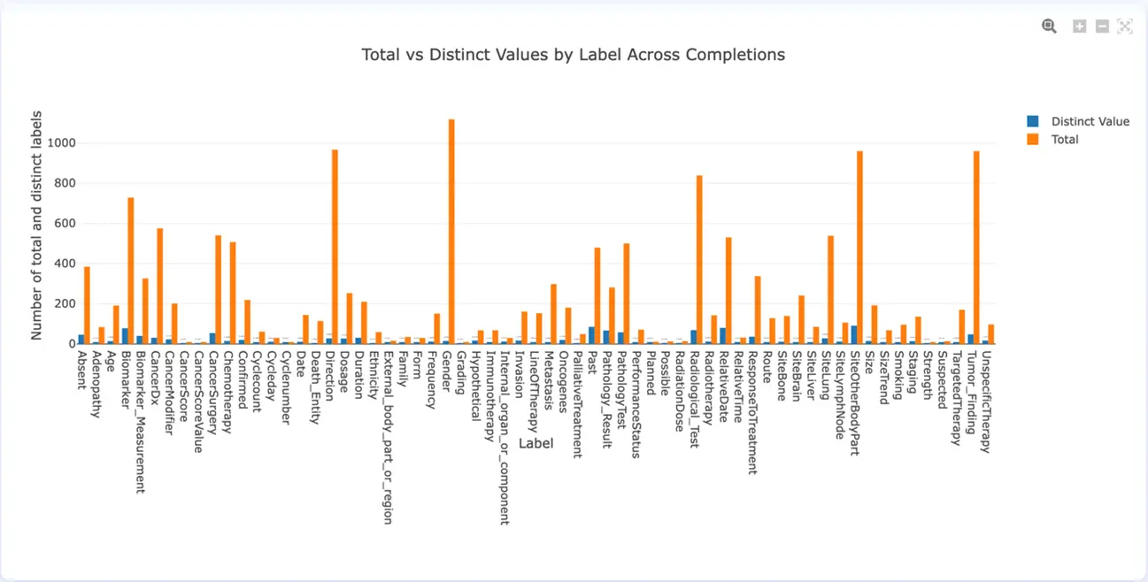
Total vs Distinct Values by Label Across Completions (v. 3.4.0)
Length of extractions and numeric values
In annotation projects, the granularity of annotations is one of the keys to success. A strategic tool to assess the length of extractions is the Average Number of Tokens by Label chart. One can identify how many tokens are extracted on average for each label and further on, decide if it is worth splitting labels for more precise annotations. In general, extractions should not have more than 3 tokens, so an average higher than 2.5 could be considered high.
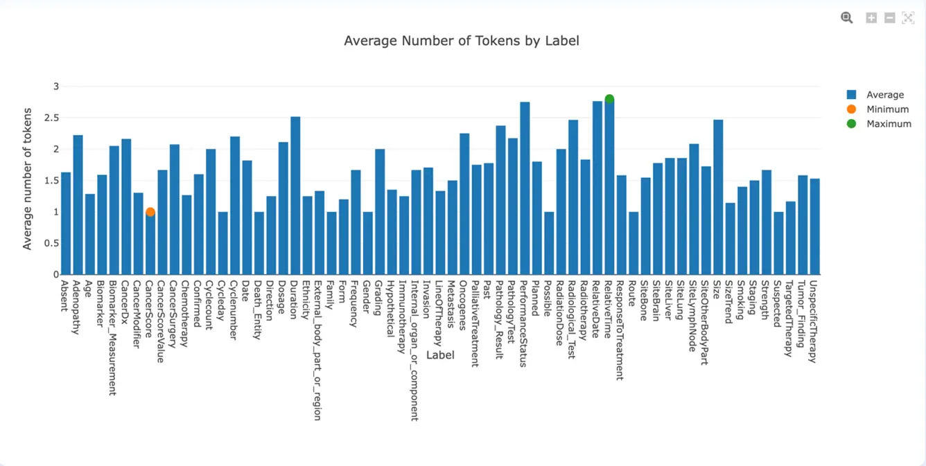
Average Number of Tokens by Label (v. 3.4.0)
Sometimes the labels require annotation of chunks that include numeric values. Usually, those are harder to learn by models. The main problem with entities that include numeric values is that sometimes models tend to confuse different entities of this kind, especially if the format of the numbers is similar. The Numeric Values Across Labels chart highlights both the percentages and count of chunks containing numeric values for each label. In case the model does not perform well on those entities consider predicting them using Rules instead.
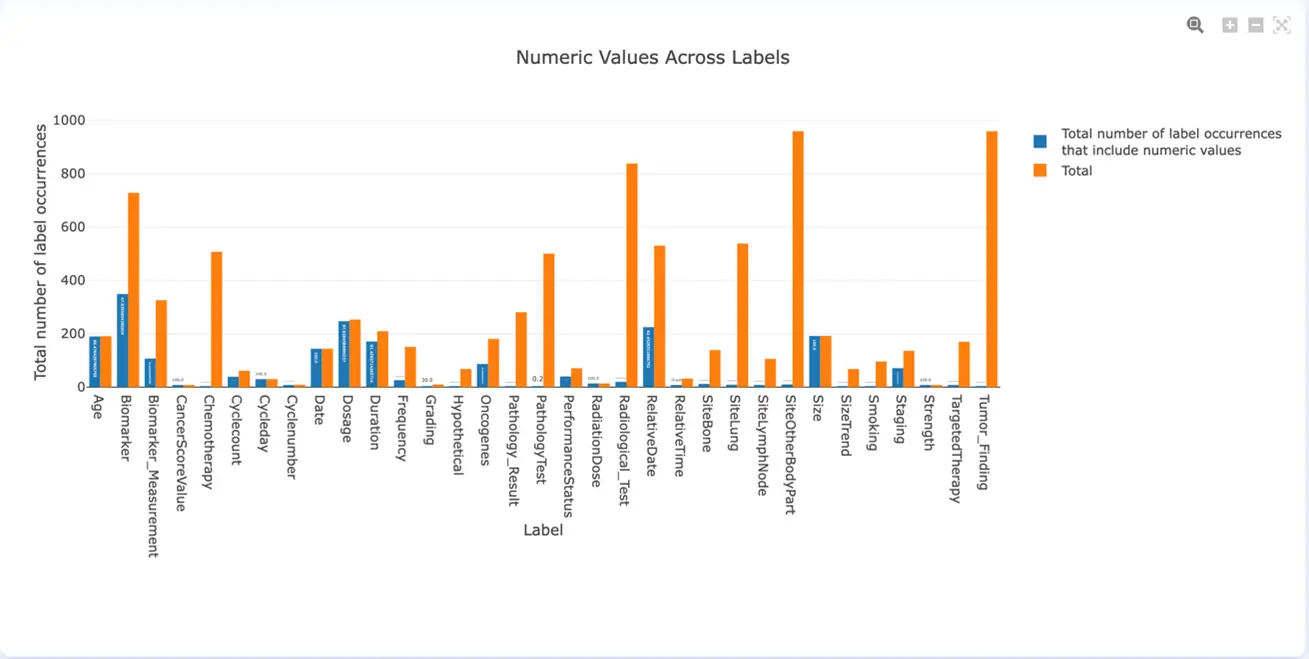
Numeric Values Across Labels (v. 3.4.0)
Stay tuned for the next part of the Analytics blog series talking about Team productivity indicators.
If you work with pdf and other image types, try image annotation tool as well.