


What is IAA
Inter-Annotator Agreement (IAA) is a measure of how consistent or aligned the manual annotations created by different team members are. It is a measure of how clear your annotation guidelines (AG) are, how uniformly your annotators understood it, and how reproducible the annotation task is. IAA is calculated by comparing the annotations created by different team members on a pool of common tasks, according to the same guidelines. When there is a high level of agreement between team members, you can assume that the entities have been clearly defined and delimited and that your model will be able to reach high-quality metrics.
However, in real-life situations even when AGs are crystal clear it is normal to find some level of disagreement between different team members as language is nuanced and subjective.
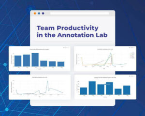
User-friendly Inter-Annotator Agreement Charts
High-level Agreement Overview
The first chart on the IAA page gives a general overview of the level of agreement between the two annotators selected from the right-side dropdowns. This aggregate is calculated on the common tasks assigned to both annotators. The result is an average of the agreement levels obtained at the entity level.
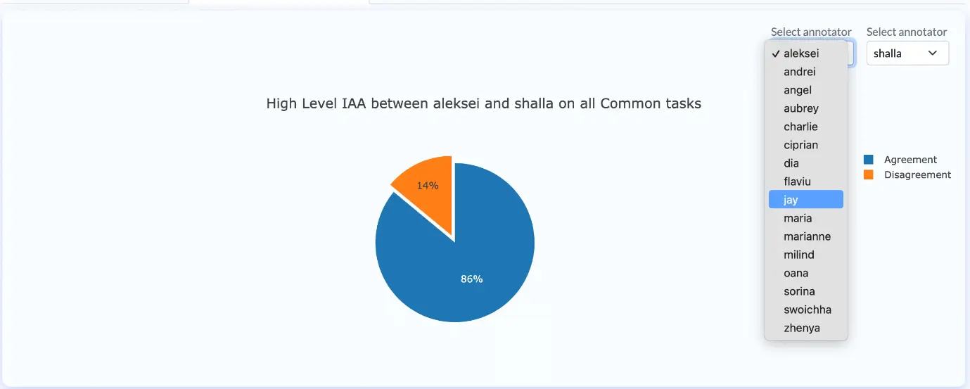
Percentage pie-chart of High-Level IAA chart (Annotation Lab 3.5.0)
Label level agreement
The percentage of inter-annotator agreement for each label in the taxonomy is displayed in a user-friendly style in the following chart. In the upper right corner, different annotators can be selected for comparison. Project Managers can use this chart for identifying challenging labels – the ones with a low agreement. Those must be reviewed together with the corresponding Annotation Guidelines (AG) in order to identify the source of confusion and clarify all outstanding issues/questions.
Apart from identifying challenging labels (which would require AG refinement), using this chart you can spot single annotators that may not be following the most updated extraction rules.
Concretely, the difference between those two cases is:
- challenging labels: there is relatively low agreement in most of the pairs of annotators.
- an issue with one of the annotators: relatively low agreement is found only when the annotations from that team member are considered.
No matter the source/reasons for low agreement, this must be solved – the contradicting annotations must be corrected according to the updated AGs for ensuring coherence of annotations across all tasks.
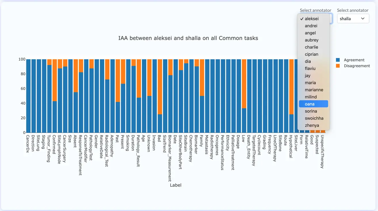
Inter Annotator Agreement chart on all common tasks (Annotation Lab 3.5.0)
Chunk level analysis
The following chart provides a very specific chunk level agreement test between two annotators. All chunks included in their common tasks will be compared and whenever the label used by the two annotators do not match, a disagreement will be flagged. The chart only shows a sample of 20 color-coded entries of the entire list of chunks which can be downloaded in CSV format from the button on the upper right corner.
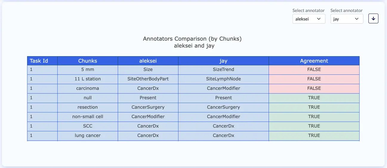
Chunk comparison between annotators (by chunks) (Annotation Lab 3.4.0)
Human vs Machine
This analytics chart compares predictions and ground truth annotations and can be generated for each annotator-model pair. Green (TRUE) indicates a chunk is annotated in the same manner by the annotator and the model, while red identifies the differences. This chart, only shows a preview of the entire list of chunks, but this can be download in CSV format by clicking the download button (highlighted with red circle).
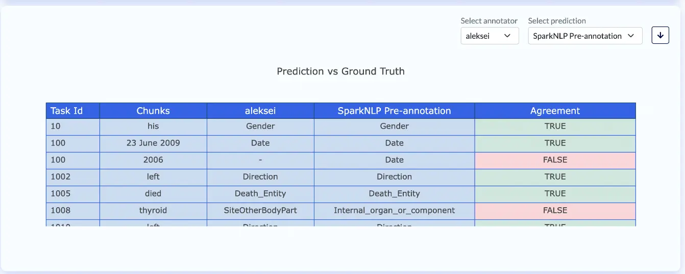
Prediction compared to Ground Truths (Annotation Lab 3.4.0)
Chunks Frequency per Annotator
Another helpful chart is the Chunk Extracted by Annotator. This illustrates the list of chunks annotated by a given annotator and the associated Label together with Frequency information. Once again, the chart only presents a preview of the entire dataset, but a complete CSV file can be downloaded for further analysis.
This list provides a way of identifying edge cases and wrong labels. For instance, when the same chunk is annotated 26 times with one label and 1 time with another label, there might be an error in the second annotation which should be checked by the annotators/reviewers.
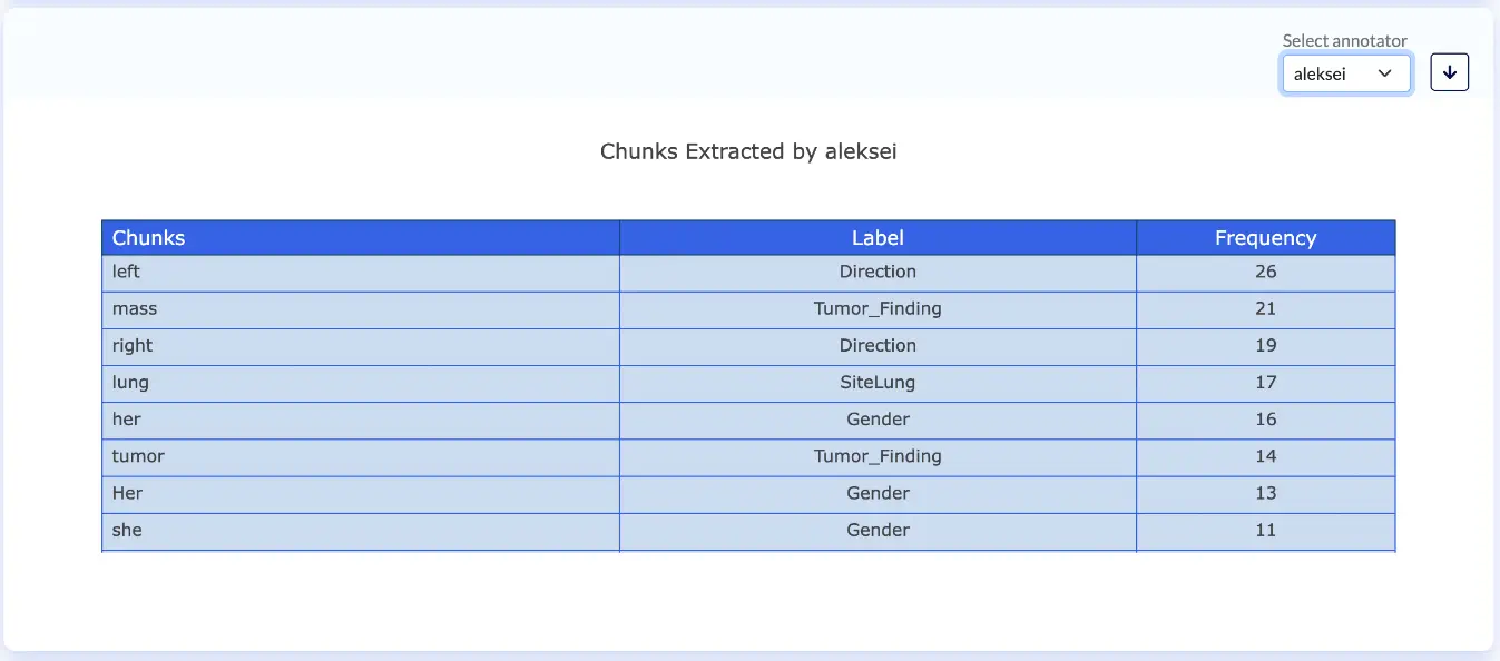
Chunks extracted by annotator (Annotation Lab 3.4.0)
Chunks Frequency per Label
Another version of the Chunks Frequency chart is obtained when slicing the data by Label. As such, in the Chunks Extracted by Label chart, users can see how often an individual chunk was annotated with a particular Label by each one of the annotators assigned to the project. Each annotator has their own method for annotating chunks and this can lead to IAA discrepancies. This chart simplifies the evaluation of annotator disagreements and precisely pinpoints problematic extractions.
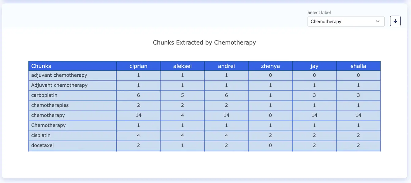
Chunks extracted by label (Annotation Lab 3.4.0)
Final thoughts
In this series of 3 blog posts, I illustrated the usage and utility of each one of the analytical charts provided out-of-the-box by the Annotation Lab. By default, the Analytics dashboards page is disabled. Users can request Admin to enable the Analytics page. The request can be seen by the Admin user’s account, on the Settings page. Once the Admin user approves the request, users can access the analytics page.
A refresh button is also available on the analytics page. Changes made by the annotators (like creating tasks, adding new completion, etc.) will not be automatically reflected in the Analytics charts. However, the latter can be updated by pressing the refresh button.
We welcome any feedback and new ideas so if you have any suggestions on new analytics charts that would further ease your work please let us know via email at: product@johnsnowlabs.com .