


Project managers running clinical NLP annotation at scale face a recurring problem: quality issues surface weeks after they become expensive to fix. By the time inconsistent labeling patterns appear in exported training data, hundreds of tasks require rework. By the time annotation bottlenecks delay the timeline, the project is already behind schedule.
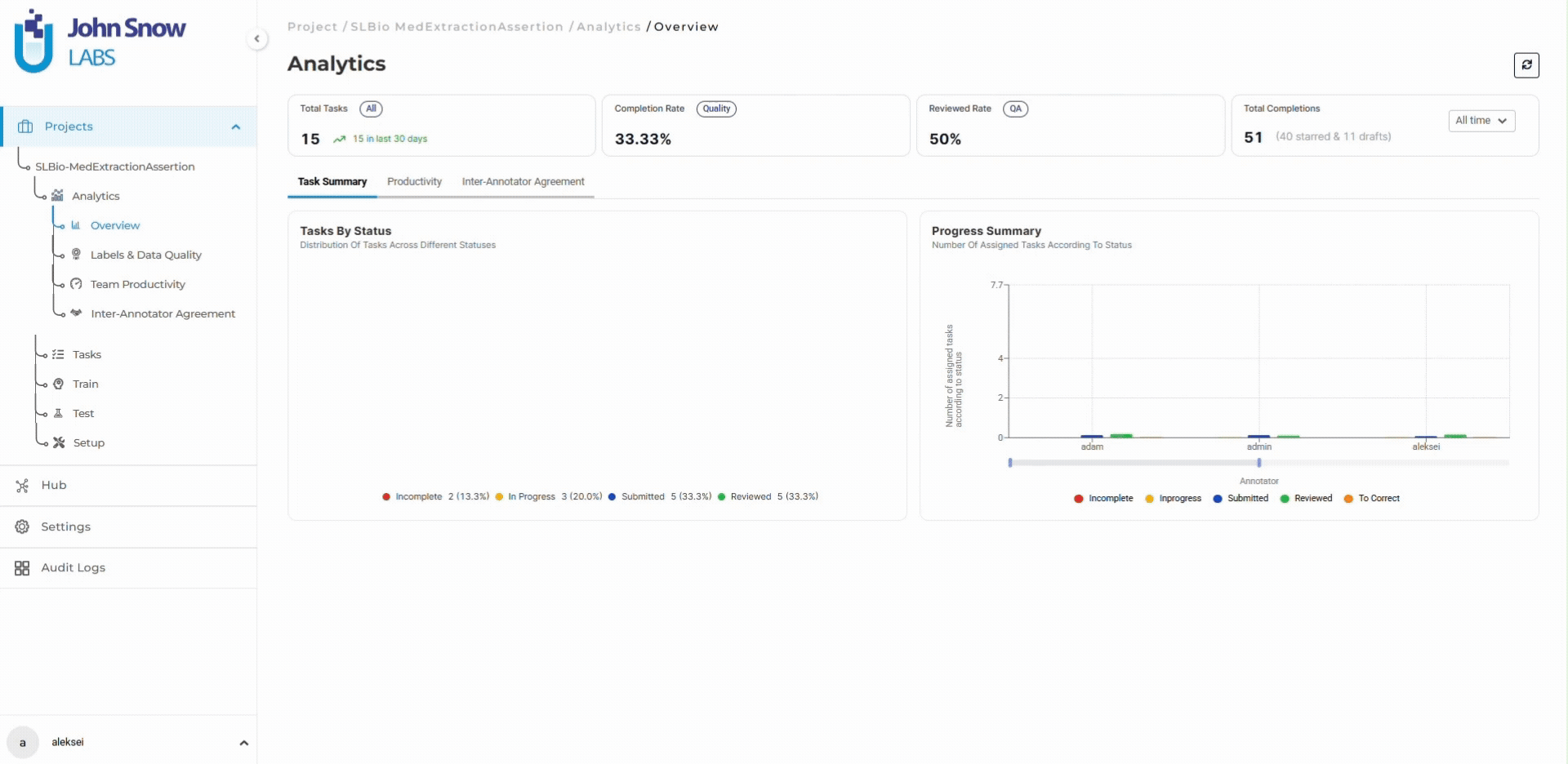
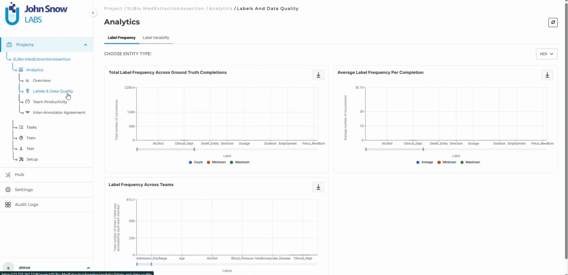
The Analytics Dashboard in Generative AI Lab provides real-time quality metrics for regulatory-grade annotation workflows, operating within HIPAA-compliant infrastructure where no data leaves the customer’s environment. Teams catch quality drift within days, identify capacity constraints before they delay timelines, and validate training data readiness with quantitative evidence.
Real-time visibility into quality, velocity, and bottlenecks keeps annotation workflows on schedule when datasets reach thousands of tasks, and quality requirements are non-negotiable.
Baseline Establishment: Day-One Metrics for Large-Scale Projects
Consider a healthcare organization launching an NER project to extract Problem, Test, and Treatment from 8,000 clinical discharge summaries. The Analytics Dashboard establishes the operational baseline on day one.
The dashboard shows task distribution: 8,000 tasks imported, 0 annotated, 0 in review. Team capacity: 6 annotators assigned, 0 active hours logged. Quality baseline: no inter-annotator agreement data yet, which will establish itself as work begins.
The project manager sets targets: maintain 90%+ inter-annotator agreement on entity boundaries, complete annotation within 90 days at 89 tasks/day average velocity. The dashboard tracks actual performance against both benchmarks continuously.
This baseline visibility matters because it creates the quantitative foundation for early course correction. Without it, teams operate on estimates. With it, deviations from plan surface immediately.
Early Quality Detection: Catching Gaps in Annotation Guidelines Before They Compound
Three days into annotation, the dashboard shows velocity at 60 tasks/day (33% below target) and quality signals appear for the first time.
Inter-annotator agreement metrics:
- Treatment: 92% (above target)
- Problem: 78% (12 points below target)
- Test: 81% (9 points below target)
The diagnosis agreement issue surfaces because annotators handle multi-word entities inconsistently. “Type 2 diabetes” gets labeled as a single span by some annotators, split into separate tokens by others. The annotation guidelines didn’taddress this case explicitly.
Response time: 3 days, not 3 weeks.
The project manager updates guidelines with specific multi-word entity examples, runs a 15-minute team calibration session, and re-assigns 50 completed tasks for correction under the clarified rules. Agreement on Problem reaches 90% within two days.
Cost of detection at day 3: 50 tasks reworked, minimal timeline impact.
Cost if detected at week 8: hundreds of tasks requiring correction, potential model retraining, multi-week schedule delay.
The dashboard made the quality gap visible when fixing it was still operationally cheap.
Bottleneck Identification: Review Queue Growth as a Leading Indicator
At week 4, annotation velocity has improved to 85 tasks/day following the guideline clarification. The project is 30% complete (2,400 tasks annotated). But the dashboard reveals a problem: 680 tasks are sitting in “Submitted” status waiting for review, and the queue is growing by 41 tasks per day.
Workflow metrics reveal the constraint:
- Annotation throughput: 85 tasks/day (6 annotators averaging 14 tasks/day each)
- Review throughput: 44 tasks/day (2 reviewers averaging 22 tasks/day each)
- Review queue growth: +41 tasks/day (net accumulation)
- Current backlog: 680 tasks waiting for validation
At current rates, the review queue reaches 1,500 tasks by week 8, creating a multi-week delay even after annotation completes. The dashboard shows this trajectory before it becomes a timeline crisis.
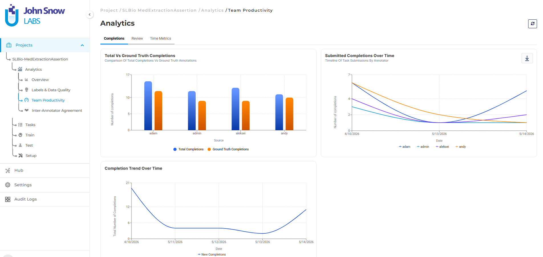
Capacity reallocation based on quantitative evidence:
The project manager reassigns one high-performing annotator to review duties temporarily, increasing review capacity from 2 to 3 team members. Review throughput rises to 66 tasks/day. The queue stabilizes at 290 tasks within a week.
Reassigning an annotator to review temporarily reduces annotation throughput. The project accepts this tradeoff: slower task completion is better than a multi-week delay clearing the review queue after annotation finishes. Velocity drops from 85 to 78 tasks/day for two weeks, but the review backlog stabilizes and the overall timeline stays on track.
Capacity planning is driven by real-time workflow metrics, not guesswork about where the bottleneck might be.
Quality Drift Detection: Agreement Degradation as an Early Warning Signal
At week 7, the project is 65% complete and on schedule. Velocity is stable. But the dashboard shows a quality trend that wasn’t visible at task level.
Agreement metrics by entity type over time:
- Treatment: 96% (stable, above target)
- Test: 92% (stable, above target)
- Problem: 86% (down from 91% two weeks prior, below target)
Recent tasks involve more complex discharge summaries with patients who have multiple comorbidities, overlapping diagnoses, and ambiguous phrasing. Annotators are interpreting these cases differently, and agreement is degrading.
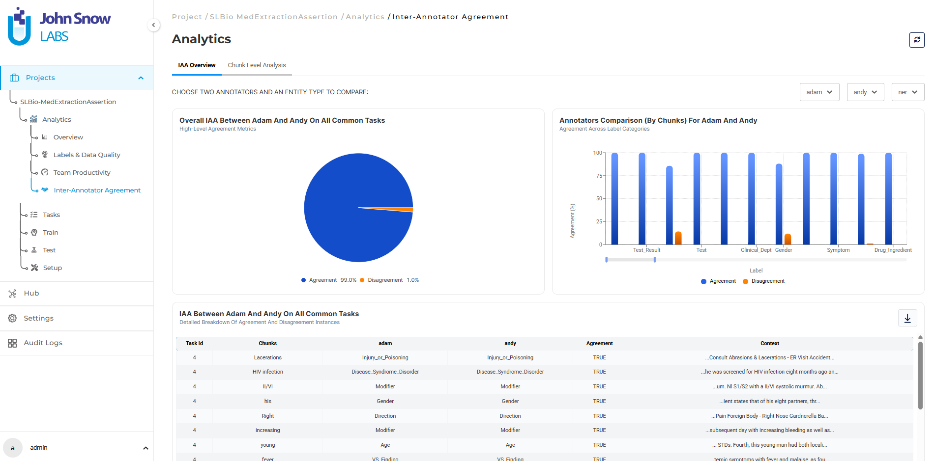
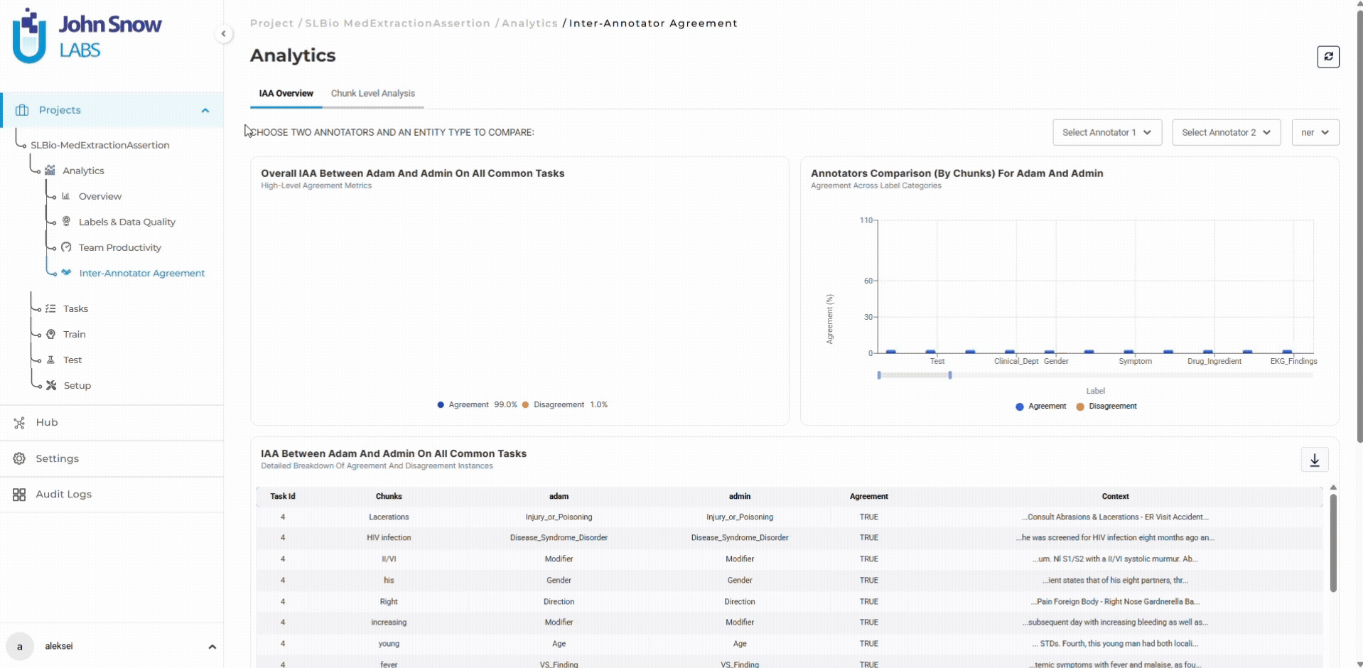
The dashboard breaks down agreements by label type. The project manager reviews 20 recent diagnosis annotations with low agreement scores, identifies three recurring ambiguity patterns, and updates guidelines with disambiguation rules.
She runs a calibration session where the team annotates 10 shared complex examples together. Agreement on diagnoses returns to 90% within three days.
Agreement degradation appears as a leading indicator, enabling guideline updates before inconsistent patterns compound into systematic errors that require large-scale rework.
Export Validation: Quantitative Confirmation of Training Data Readiness
At week 11, annotation is 95% complete. The project manager uses the dashboard to validate that the dataset is export-ready.
Training data quality metrics:
- 7,600 tasks completed and reviewed (95% of total)
- Overall inter-annotator agreement: 91% (6 points above target)
- Average task completion time: 3.2 minutes (down from 4.1 minutes at week 1, indicating workflow efficiency improvement)
The dashboard shows entity distribution across the dataset:
- Treatment: 18,400 instances
- Problem: 22,100 instances
- Test: 14,800 instances
This confirms sufficient annotation volume for each entity type.
Dataset richness metrics reveal:
- Treatment: 18,400 total annotations, 3,847 distinct medication mentions (21% unique)
- Problem: 22,100 total annotations, 4,982 distinct diagnosis mentions (23% unique)
- Test: 14,800 total annotations, 2,156 distinct procedure mentions (15% unique)
High distinct-to-total ratios indicate diverse entity coverage. The model will see varied real-world examples, not repetitive instances of the same few entities.
The data meets quality targets. The dashboard confirms it with quantitative evidence. Export happens with confidence that the training data is production-ready.
Operational Intelligence Across Project Roles
Project managers use the dashboard for timeline and capacity planning. Task velocity trends project completion dates accurately. Bottleneck identification enables resource reallocation before delays accumulate. Quality targets are tracked continuously, not validated only at export.
For multi-entity annotation projects where dozens of entity types create multiple potential quality issues, the dashboard’s entity-specific metrics make it possible to identify which labels need guideline clarification without waiting for model training to reveal problems.
Annotation team leads use the dashboard for targeted coaching and guideline refinement. When individual annotator productivity drops or agreement scores decline on specific entity types, team leads see these patterns in real time and intervene before they affect hundreds of additional tasks.
Time management metrics show when annotators spend excessive time on corrections, indicating guideline ambiguity or training gaps that need immediate attention.
Data scientists preparing training datasets use the dashboard to validate data quality before export. Label frequency charts confirm sufficient annotation volume. Distinct value metrics reveal dataset variability. For projects using pre-annotation, the dashboard validates model performance by comparing automated predictions against human-validated ground truth.
Annotators see their own productivity and quality metrics in real time. When agreement scores drop on a specific entity type, they request clarification immediately rather than continuing with ambiguous guidelines. Progress visibility makes contribution measurable and completion timelines concrete.
Why Real-Time Visibility Matters for Regulatory-Grade Annotation
Healthcare AI annotation operates under constraints that generic crowdsourced labeling doesn’t face. PHI handling requirements mean work can’t be offshored. Regulatory standards mean training data quality is non-negotiable. Timeline and budget limitations mean overruns have direct cost consequences.
Without real-time metrics, annotation operates as an opaque process where problems surface at export. With the dashboard, quality issues and workflow constraints appear while they’re still cheap to fix.
Projects stay on schedule because workflow bottlenecks appear as leading indicators, not as retroactive explanations for delays.
Quality stays above target because inter-annotator agreement drift is visible within days, enabling guideline updates before inconsistent patterns compound into systematic errors.
Teams stay aligned because project managers, team leads, and annotators see the same operational metrics, eliminating the information gap that creates misalignment.
Annotation provenance is defensible because all quality decisions, workflow adjustments, and team actions are logged with complete audit trails that satisfy regulatory review requirements.
Frequently Asked Questions
Q: How quickly do quality metrics like inter-annotator agreement become meaningful in a new project?
Agreement metrics appear after the very first task is annotated by multiple team members. Early scores establish the baseline. Trends become actionable within the first week of annotation work.
Q: Can the dashboard track quality for pre-annotation as well as manual annotation?
Yes. The dashboard shows agreement between pre-annotation predictions and human corrections, enabling teams to validate model performance and identify entity types where pre-annotation needs improvement.
Q: What happens when annotators work at different speeds? Does the dashboard flag productivity outliers?
Individual productivity metrics are visible to team leads. Annotators working significantly above or below team average are identifiable for coaching, advanced training, or workload rebalancing. The dashboard does not penalize slower work if quality is high. It provides context for performance conversations.
Q: How does the dashboard handle projects with multiple annotation workflows (e.g., initial labeling plus review plus adjudication)?
Task status is tracked across all workflow stages. The dashboard shows how many tasks are at each stage, how long tasks spend in the annotation, edit or review stages on average, and where bottlenecks are accumulating. Multi-stage workflows get stage-specific velocity and queue metrics.
Evaluate on Your Annotation Workflow
Run a pilot project with your team and validate inter-annotator agreement on your clinical documents:
Track quality metrics in real time on your HIPAA-compliant infrastructure: