was successfully added to your cart.

Data Science

Blog about Science

The World Health Organization (WHO) Family of International Classifications (FIC)

By Big Data Healthcare, Data Science, Datasets

In a situation like the one the world is experiencing now, where there is an epidemic or a pandemic, we must know how to read and deal with data on the WHO website.  Most of the data and diseases on the WHO websites and represented through standard codes.  International classification of diseases (ICD) is one of the most important standardized codes as it is relevant to the diagnostic classification of diseases.

This blog will introduce a primer to the WHO Family of International Classifications with a focus on ICD.


An introduction to FIC and ICD

ICD is a member of the family that became the main pillar for healthcare research, especially when it comes to studies assessing common patterns and forecasting. It has been translated into 43 languages.  ICD is being used in 117 countries to report mortality data and for monitoring health status.

It can be considered a context for coding of the causes of illness and injury that is done on a global scale under the supervision of the WHO.  According to the WHO, ICD can be defined as “International standard diagnostic classification for all general epidemiological and many health purposes”.

ICD is revised periodically to include changes in the medical field.

The scope of WHO-FIC includes:

  • Health status Environmental health.
  • Health care (including rehabilitation) Food standards and hygiene.
  • Health policy and planning Health screening.
  • Disability policy and planning Prevention of hazardous and harmful drug use.
  • Communicable disease control Public health research.
  • Selected health promotion External causes of injury.
  • Organized immunization Occupational health.

The following diagram is a simple representation of the FIC, followed by a table describing the acronyms used in the diagram.

Figure 1: WHO - Family of International Classifications

Figure 1: WHO – Family of International Classifications


Table 1: Acronyms related to the WHO Family of International Classification

Table 1: Acronyms related to the WHO Family of International Classification

Different revisions of ICD were released.  There are differences between each release and the other.  Currently, the most adopted revisions in the world are ICD-9, ICD-10, and ICD-11.Table 1: Acronyms related to the WHO Family of International Classification


How ICD-10 is different from ICD-9?

  • ICD-10 is included in 3 Volumes while ICD-9 is included in 2 volumes only.
  • ICD-10 codes are Alpha-Numeric while ICD-9 codes are numeric-only.
  • Some chapters of ICD-9 are rearranged in ICD-10.
  • Some titles that were used in ICD-10 are changed in ICD-10.
  • Conditions are regrouped in ICD-10.
  • ICD-10 has twice the number of categories than ICD-9.
  • Minor changes in the coding rules for mortality took place.


What is new in ICD-11?

  • ICD-10 contained 14,400 items. There are 55,000 in the ICD-11.
  • 31 countries were involved in field testing for ICD-11. 1,673 participants are taking part in 112,383 code assignments.
  • ICD-11 includes circumstances affecting health (dissatisfaction with the situation at school and low levels of personal hygiene).
  • In ICD11, diseases that occur on the background of HIV infection have a special code.
  • All types of diabetes are described in detail.
  • ICD-11 includes a section for “Objects involved in the injury”. Doctors can encode any event in your life that affected your health.
  • “Transsexualism” and other “gender identity disorders” are mentioned in a new section concerned with sexual health instead of mental and behavioral disorders.
  • The diagnosis of “hermaphroditism” is not present anymore. Instead, this condition is pointed to as a “violation of gender formation”.


Uses of ICD

ICD is used to classify diseases recorded in different records like death certificates and medical records.

Moreover, it can be used in analyzing general health for population groups, monitoring incidence, the prevalence of diseases, determining characteristics and circumstances of individuals affected by a specific disease for evidenced-based decision-making.  It can also help in observing reimbursements and enforcing quality standards.

Its uses according to the WHO:

  • It can be used to Classify epidemiological and healthcare problems, enable storage and retrieval of diagnostic information (clinical & epidemiological).
  • Compilation of national mortality and morbidity.

Its uses according to the CDC (Centers for Disease Control and Prevention):

  • Promoting international comparability in the collection, processing, classification, and presentation of mortality statistics.
  • Reporting causes of death of the death certificate.


Clinical Classifications Software (CCS)

Clinical Classifications Software (CCS) for the ICD-10-CM database is available on the HCUP website in raw form, on John Snow Labs (JSL) repository website, where the reader can get it in a clean and normalized form.

The previously mentioned data package should be of great use to decision-makers, healthcare researchers, medical students, and even for those who are unfamiliar with the medical terminologies as all abbreviated terms are replaced with full form, unlike the Healthcare Cost and Utilization Project (HCUP) original datasets which are full of abbreviations.

The provided link offers 6 datasets:

  1. Clinical Classification Software for ICD-10 CM.
  2. Clinical Classification Software for ICD-10 PCS.
  3. Clinical Classification Software for Mortality Reporting Program.
  4. Multi-Level Clinical Classification Software ICD-10 CM and PCS Codes.
  5. Single Level Clinical Classification Software ICD-9 Diagnosis Codes.
  6. Single Level Clinical Classification Software ICD-9 Procedure Codes.


You can make a difference

The WHO has designed a web platform for ICD-11 where you can add your inputs.  Your inputs may include your comments regarding the classification structure and content.  You can also provide proposals to change ICD categories, definitions of diseases, or participate in field testing.

Evidence-Based Medicine (EBM) and Data Science – Part 2: Mining the PubMed Database

By Data Science

The last blog (A Primer to EBM – Part [A]) introduced in brief the well-known healthcare research databases, their structure, and the steps followed to determine the best and most recent clinical decision.

This blog will extend further the structure of the PubMed database and how we can work with it to extract the best clinical guidelines or the best clinical decision.

UNDERSTANDING MESH

The National Library of Medicine’s Medical Subject Headings (MeSH)

It is a well-organized and indexed nomenclature for medical terms supplied by the US National Library of Medicine. MeSH indexing can be considered a summary for the medical literature where the data quality is guaranteed and well-reviewed.

The MeSH database is available for download here.

The recent ASCII MeSH download file is: d2019.bin

Due to its hierarchies and branching structure, most researchers describe MeSH as a tree structure, but Jules J. Berman thinks that this is not an accurate description as a single entry may be assigned multiple Mesh Numbers (MN). This means that different branches and nodes can be interconnected together.

The record for a MeSH term contains:

– A definition of the term.

– Associated subheadings.

– A list of entry terms.

The following is a sample of a MeSH record:

Figure 1: How does a MeSH record look like?

A MeSH record can be analyzed as follows:

– MeSH Term “Apicoectomy” is assigned 3 MeSH Numbers:

MN = E04.545.100

MN = E06.397.102

MN = E06.645.100

By removing the last set of numbers after the last decimal, we can obtain the Mesh Number of the “Parent Term”.

This can be explained as follows:

Figure 2: MeSH Parent Term

Note that, each “Parent Term” can be assigned multiple Mesh Numbers, where each one can yield a multibranch hierarchy and therefore Jules J. Berman considered it a non-tree structure as explained before.[1]

Many studies compared using extraction techniques which are based on MeSH descriptors versus other techniques that are based on extraction from titles, abstracts, or the full-text. Other studies focused on the development of open-source literature mining tool. Some tools were developed mainly to detect the relationships between MeSH descriptors in MEDLINE.

In the following section a sample from different the efforts done in the development of different tools, packages and frameworks will be represented and explained in brief.

LITERATURE MINING TOOLS, PACKAGES, and FRAMEWORKS

2.1 PubMedMineR

PubMedMineR is an R package with text-mining algorithms to analyze PubMed abstracts [2]. It can be used to figure out MeSH-based Associations in PubMed [3]

The PubMed.MineR tool and its documentation are available here or from here.

The tool offers a different set of functionalities that allows the user to read and retrieve information (in XML format). Other sets of functions are entitled to classify documents into categories or provide automatic summarization of a set of documents. Another function is recognizing and normalizing named entities (like genes, proteins or drugs).

The workflow includes 4 phases: searching and retrieving; (2) filtering MeSH descriptors (using UMLs); (3) Statistical reports generation (for UMLs used and MSH descriptors) and, (4) Figuring out association rules between filtered MeSH descriptors.

The output can be displayed in different formats (as plain text, XML, or PDF).

2.2 MeSHmap

This tool aims to exploit the MeSH indexing related to MEDLINE records. MeSHmap has different features: (1) search via PubMed; (2) user-driven exploration of the MeSH terms and subheadings in the result. The visionary plan of the tools includes promising features like comparing entities of the same category (drugs or procedures) and generate maps for the entities where the relationship between two entities in the map is proportional to the degree of similarity in the MeSH metadata of the MEDLINE documents [4].

2.3 MedlineR

MedlineR is an open source library written in R language and used for the data mining of the Medline literature [5].

It entails different functions that could query the NCBI PubMed database, build the co-occurrence matrix, and help in the visualization of the network topology of the query terms.

Users can add their inventions to extend the functionalities of the library using R language. Bioinformaticians are invited to develop more and more tools based-on or using MedlineR.

2.4 Data Mining with Meva in MEDLINE

Medline Evaluator (Meva) is a medical scientific data-mining web service for analyzing the bibliographic fields returned by a PubMed query [6].

In Meva, results are well represented graphically representing counts and relations of the fields using different graphical and statistical methodologies (histograms, correlation tables, detailed sorted lists, or MeSH trees).

Advanced features include applying filters to limit the analysis in the mining process. The output can be populated in different formats (HTML or in a delimited format). The results can then be either be printed, imported to medical databases, or displayed offline.

You can try Meva here.

2.5 PubMedPortable

PubMedPortable is a framework used to support the development of text mining applications [7].

There are many tools that could identify named entities (review section 2.1).

Although PubMed is a huge biomedical literature database, there is no known way to apply Natural Language Processing (NLP) tools or connect them to it. So, there is a great need for a data environment where different applications can be combined to develop text mining applications.

PubMedPortable builds a relational in-house database from a full-text index based-on PubMed articles and citations. It provides an interoperable environment where different NLP approaches can be applied in different programming languages. In addition, queries can be run on several operating systems without facing any problems.

The software can be downloaded here for free (for Linux). For other operating systems you must use a virtual container.

If you want to try any of the previous tools to be trained on querying PubMed, you can use John Snow Labs healthcare data sets that include the “MEDLINE PubMed Journal Citation Database” to validate your results.

This dataset contains NLM’s database of citations and abstracts in the fields of medicine, nursing, dentistry, veterinary medicine, health care systems, and preclinical sciences.


REFERENCES

[1] Berman JJ. Methods in medical informatics: fundamentals of healthcare programming in Perl, Python, and Ruby. Boca Raton, FL: CRC Press; 2011.

[2] Rani J, Shah AR, Ramachandran S. pubmed.mineR: An R package with text-mining algorithms to analyse PubMed abstracts. J Biosci. 2015;40(4):671–82.

[3] Zhang Y, Sarkar IN, Chen ES. PubMedMiner: Mining and Visualizing MeSH-based Associations in PubMed. AMIA. Annu Symp proceedings AMIA Symp [Internet]. 2014;2014:1990–9. Available from: http://www.ncbi.nlm.nih.gov/pubmed/25954472%0Ahttp://www.pubmedcentral.nih.gov/articlerender.fcgi?artid=PMC4419975

[4] Srinivasan P. MeSHmap: a text mining tool for MEDLINE. Proceedings AMIA Symp [Internet]. 2001;642–6. Available from: http://www.ncbi.nlm.nih.gov/pubmed/11825264%0Ahttp://www.pubmedcentral.nih.gov/articlerender.fcgi?artid=PMC2243391

[5] Lin SM, McConnell P, Johnson KF, Shoemaker J. MedlineR: An open source library in R for Medline literature data mining. Bioinformatics. 2004;20(18):3659–61.

[6] Tenner H, Thurmayr GR, Thurmayr R. Data Mining with Meva in MEDLINE. 2011;39–46.

[7] Döring K, Grüning BA, Telukunta KK, Thomas P, Günther S. PubMedPortable: A framework for supporting the development of text mining applications. PLoS One. 2016;11(10):1–15.

Evidence-Based Medicine (EBM) and Data Science – Part 1: A primer to Evidence-Based Medicine

By Data Science

There is a continuous need for knowing the best and most recent line of treatment for every known medical condition. The cumulative experience over centuries and over different cultures yielded an enormous amount of data and researches. For a clinical decision maker, there is a need to pick out the best clinical decision among all the pile accumulated over the years. A fast and accurate search process will lead to a better and more effective healthcare service that could be more satisfactory to the patient.

If the clinician followed the right EBM methodology, this could be an auto-defense for him/her in the court against any claims (like why s/he chose this line of treatment and not that).

This blog is a trial to simplify the process of Evidence-Based Medicine to Junior Data Scientist as many of them could be of different scientific background than healthcare or maybe some of them know little about healthcare research methodologies.

This blog will be just an introduction to EBM and the most famous healthcare databases and their structure. Next parts will be published in the coming weeks to discuss the process of mining these databases.

Introducing Evidence-Based Medicine

1.1 What is EBM?

Evidence-Based Medicine is choosing the best and most UpToDate clinical decision using systematic approval. The concept was first introduced at McMaster University by David Sackett in the early 1990s.

1.2 Steps to acquire the best evidence

1.2.1 Formulate your PICOT question

The PICOT process (population, intervention, comparison, outcome, and time) is a methodology for designing a proper search strategy. Setting a research question in the PICOT format is considered an evidence-based approach to track down the literature.

1.2.2 Track down the literature

This step entails setting a search strategy including specific keywords, inclusion and exclusion criteria. The search starts then using these keywords, and according to the inclusion criteria and excluding the results that comply with the exclusion criteria.

1.2.3 Search the Healthcare Research Databases

They are collections of journals, magazine articles, dissertations, systematic reviews, and abstracts. Such collections are acquired by the library. The contents are reviewed and organized.

1. Medline/PubMed: This database created and maintained by the United States National Library of Medicine (NLM) of the National Institutes of Health. It includes biomedical literature from 1966 onward. It is concerned with fields of (medicine, dentistry, nursing, veterinary medicine, health care services, and the preclinical sciences). Pubmed is a free access server that provides access to over 11 million Medline citations. It includes publications published in 40 different languages.

The US National Library of Medicine offers a wonderful Nomenclature of medical terms called “MeSH”.

The MeSH database is available for download here.

The recent ASCII MeSH download file is: d2019.bin

The record for a MeSH term contains:

  • A definition of the term.
  • Associated subheadings.
  • A list of entry terms.

You can use a python script to create a SQLite database for MeSH. Note that, a single MeSH term may have more than one MeSH code. We will explain the MeSH database further and working with them in the coming blogs in the next weeks.

John Snow Labs catalogs have more than 1775 normalized health datasets, most of them are freshly curated and machine and manually validated.

Among these datasets, you can find a very valuable dataset that includes the “MEDLINE PubMed Journal Citation Database”. This dataset contains NLM’s database of citations and abstracts in the fields of medicine, nursing, dentistry, veterinary medicine, health care systems, and preclinical sciences.

2. Embase

Embase supports the EBM methodology by providing a search form that allows the user to formulate the search using the 4 PICO elements. Embase provides literature from 1947 to the present, including 32 million records (including MEDLINE titles). Moreover, it includes publications from over than 8,500 journals from over 95 countries. Journals that are unique to Embase are 2,900 journals.

The Emtree thesaurus is a hierarchy for controlled vocabulary for biomedicine and the related life sciences. It is is used to index all contents of the Embase database content.

Emtree terms and their synonyms are used in the search query to enhance the outcome of the so-called “PICO-based search”.

3. Ovid

The OvidOpenAccess provides more than 70,000 journal articles and abstracts from more than 200 peer-reviewed journals published by Medknow Publications.

Ovid uses mapping and subheadings where the user can choose to explore the keyword to include all results using the stated term and all its related terms.

4. The Cochrane Collaboration

Cochrane objectives and strategies focus on providing support for a better healthcare decision through maintaining an up-to-date systematic review of randomized controlled trials of healthcare and provide online access to them.

Cochrane comprises 3 databases within itself. This can be explained as follows:

  • The Cochrane Database of Systematic Reviews.
  • The Cochrane Controlled Trials Register (contains about 300,000 controlled trials).
  • The Database of Abstracts of Reviews of Effectiveness (DARE).

5. Other databases and tools

Medline, Ovid, Embase, and Cochrane are not the only healthcare databases. There are PsycINFO, ProQuest, CINAHL, and Google Scholars.

Other traditional search engines (like Google, Bing, and Yahoo) may be involved in the search process as well.

Please Remember this for the coming blogs:

Emtree: used for full-text indexing of all journal articles in Embase.

MeSH: used to index articles for MEDLINE.

Relying on one database is not enough. Among all the known published control trials, only (30% -80%) were identified after mining the MEDLINE database. Researchers agreed that at least 2 databases should be included in any search strategy.

1.2.3 Appraise the results

Your search results are not guaranteed. The quality of these studies might be questionable. Systematic-Reviews that include meta-analysis is placed on the top of the “Evidence Pyramid”. They are considered the most trustable. Systematic reviews (only) can be ranked second. RCTs are ranked the third while Case Studies represents the bottom of the Evidence Pyramid.

So, Results from Cochrane Reviews can be a trustable source.

The assessment process of the clinical trials studies is called “Critical Appraisal”.

Critical Appraisal depends on assessing the “Internal Validity” of the study. This can be done by considering the following inquiries:

  • Were all the groups well-represented and compared?
  • Were the study results accurate and scalable?
  • Was there a placebo effect?

The outcome of the study must be checked whether it happened by chance or not and how much was the effect.

1.2.4 Apply the results (the evidence)

After assessing the “Internal Validity”, here comes the role of “External Validity”. You must compare your patients with the patients in the study, ask yourself whether this intervention can be applied in your facility or not, and finally try to search for alternatives if the intervention is not applicable in your facility due to a specific reason.

1.2.5 Measure the effectiveness and performance of the process

You must monitor and record the whole process starting from setting your research question until implementing the suggested guidelines based on your search results.

Next parts will be published in the coming weeks to discuss the process of mining these databases using data science tools.

The Hidden Power of Folium

By Data Science, Data Ops, Data Curation

Although both Python and R are taking the lead as the best data science tools, we can still find a lot of blogs and articles discussing the eternal question “Python or R for data science”.  Most blogs end with a bottom-line conclusion that both languages are winners.  It depends on which problem you want to solve and what is the most important feature you need most in your project or work.

When it comes to data visualization, the matter is a bit different.  Most opinions tend to prefer Python. Data visualization with Python is much easier and the output is less complicated and easier to understand. Python endorses many libraries that can add advanced features to your charts.  Matplotlib, Seaborn, Folium, and Bokeh are the most commonly used libraries for data visualization in Python.  As the choice between Python and R depends on the problem you want to solve and the features you need, the choice between Python libraries and which one to use depends on which type of data you are dealing with.  Geospatial data (Geo data) is somewhat different from other datasets.


Understanding Folium

Learn and try Folium library as if you are manufacturing a car.  Car manufacturers first build the skeleton (body) of the car, painting it and finally add the wheels and other accessories. While understanding and trying Folium it is better to follow the same methodology; learn how to build the chart in its simplest form and then dive deeper to learn how to add some advanced features.

Most traditional data visualization tools like bar charts, area blots can be done by importing Matplotlib and Pandas together.

With Folium, you can plot advanced charts like heatmaps, time analysis and choropleth maps.  With one line of code, you can obtain the world map or a country map (if you know its latitude and longitude).  This blog can be considered as a primer to Folium library.  Advanced features of the library will be discussed in coming blogs.

You can use different tools to write your Python code (you can use PyCharm, Jupyter Notebook or your favorite integrated development environment (IDE)).  Jupyter Notebook will be much easier for newcomers.


Installing Folium Library and Importing it

After downloading the data, try to install Folium library, so you can import it in your code.

Run The following command outside the IPython Shell, you can run it in the command line interpreter (cmd):

pip install folium


Figure 1: Successful Installation of Folium Library


The world map by a single line of code

Now, try to draw your first world map with Folium.  It may be easier for you than a “Hello World”-program in C Language.


Figure 2: Output of Drawing the world map with Folium


Showing the country names

The previous map in Figure 2 shows only the country borders without showing the names of the countries.  If we want to show the country names, just addtiles = ‘Mapbox Bright’to your code as follows:


Figure 3: Output of Drawing the world map (with country names) with Folium


The world map by a single line of code

Make it a bit harder and move to the next level.  Try to plot a map for London.  In this case, you must determine the latitude and longitude.

import folium

london_location = [51.507351, -0.127758]

london_city = folium.Map(location=london_location, zoom_start=16)

london_city


Figure 4: Output of Drawing London map with Folium


Different Map Styles

Your map can have different styles with Folium depending on your needs.  Here is an overview of different styles you can obtain with Folium and how you can obtain them through a few lines of code:


Table 1: Different map styles obtained through importing Folium


Adding Markers

Adding markers to the map is a bit more complex.  It just takes you a few more steps:

First, create a “feature group”.  The default for a feature group to be empty when initially created.  You have then to add “children” to the empty feature group. This child is the mark we want to superimpose on our map.  This mark can have various colors and various shapes (e.g.: circular or cross).  The specific position on the mark on the map is determined latitude and longitude values.

Try to add a circular mark in the middle of London map by applying the following code:

import folium

london_location = [51.507351, -0.127758]

london_city = folium.Map(location=london_location, zoom_start=16)

london=folium.map.FeatureGroup()

london.add_child(folium.CircleMarker([51.507351, -0.127758], radius = 30, color = “blue”, fill_color= “Red”))

london_city.add_child(london)

#Adding an interactive clickable marker

folium.Marker([51.507351, -0.127758], popup=”London Center”).add_to(london_city)

london_city


Figure 5: Adding Markers using Folium


Playing with Folium

In most of the Folium applications, you will need the coordinates of the area or country or interest. John Snow Labs repository contains a free dataset including all countries latitude and longitude.

You can download the free sample found on the page as you will not need too much data to try.  If you have extensive work or need extensive training with geospatial data, you have to subscribe for the complete Geography Data Package.

Spark NLP 2.0: BERT embeddings, pre-trained pipelines, improved NER and OCR accuracy, and more

By Data Science, DataOps, Data Curation, Natural Language Processing

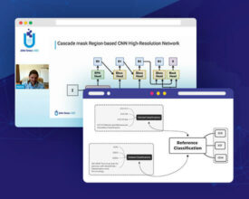
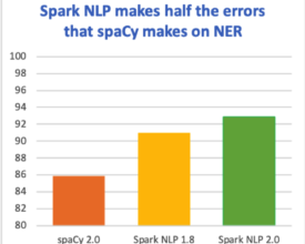
The latest major release merges 50 pull requests, improving accuracy and ease and use


Release Highlights

When we first introduced the natural language processing library for Apache Spark 18 months ago, we knew there was a long roadmap ahead of us. New releases came out every two weeks on average since then – but none has been bigger than Spark NLP 2.0.

We have no less than 50 Pull Requests merged this time. Most importantly, we become the first library to have a production-ready implementation of BERT embeddings. Along with this interesting deep learning and context-based embeddings algorithm, here are the biggest news of this release:

  • Revamped and enhanced Named Entity Recognition (NER) Deep Learning models to a new state of the art level, reaching up to 93% F1 micro-averaged accuracy in the industry standard.
  • Word Embeddings as well as Bert Embeddings are now annotators, just like any other component in the library. This means, embeddings can be cached on memory through DataFrames, can be saved on disk and shared as part of pipelines!
  • We upgraded the TensorFlow version and also started using contrib LSTM Cells.
  • Performance and memory usage improvements also tag along by improving serialization throughput of Deep Learning annotators by receiving feedback from Apache Spark contributor Davies Liu.
  • Revamping and expanding our pre-trained pipelines list, plus the addition of new pre-trained models for different languages together with tons of new example notebooks, which include changes that aim the library to be easier to use. API overall was modified towards helping newcomers get started.
  • OCR module received a suite of improvements that increase accuracy.


All of this comes together with a full range of bug fixes and annotator improvements, follow up the details below!


New Features

  • BertEmbeddings annotator, with four google ready models ready to be used through Spark NLP as part of your pipelines, includes Wordpiece tokenization.
  • WordEmbeddings, our previous embeddings system is now an Annotator to be serialized along Spark ML pipelines
  • Created training helper functions that create spark datasets from files, such as CoNLL and POS tagging
  • NER DL has been revamped by using contrib LSTM Cells. Added library handling for different OS.


Enhancements

  • OCR improved the handling of images by adding binarizing of buffered segments
  • OCR now allows automatic adaptive scaling
  • SentenceDetector params merged between DL and Rule based annotators
  • SentenceDetector max length has been disabled by default, and now truncates by whitespace
  • Part of Speech, NER, Spell Checking, and Vivekn Sentiment Analysis annotators now train from dataset passed to fit() using Spark in the process
  • Tokens and Chunks now hold metadata information regarding which sentence they belong to by sentence ID
  • AnnotatorApproach annotators now allow a param trainingCols allowing them to use different inputs in training and in prediction. Improves Pipeline versatility.
  • LightPipelines now allow method transform() to call against a DataFrame
  • Noticeable performance gains by improving serialization performance in annotators through the removal of transient variables
  • Spark NLP in 30 seconds now provides a function SparkNLP.start() and sparknlp.start() (python) that automatically creates a local Spark session.
  • Improved DateMatcher accuracy
  • Improved Normalizer annotator by supporting and tokenizing a slang dictionary, with case sensitivity matching option
  • ContextSpellChecker now is capable of handling multiple sentences in a row
  • Pre-trained Pipeline feature now allows handling John Snow Labs remote pre-trained pipelines to make it easy to update and access new models
  • Symmetric Delete spell checking model improved training performance


Models and Pipelines

  • Added more than 15 pre-trained pipelines that cover a huge range of use cases. To be documented
  • Improved multi-language support by adding French and Italian pipelines and models. More to come!
  • Dependency Parser annotators now include a pre-trained English model based on CoNLL-U 2009


Bugfixes

  • Fixed python class name reference when deserializing pipelines
  • Fixed serialization in ContextSpellChecker
  • Fixed a bug in LightPipeline causing not to include output from embedded pipelines in a PipelineModel
  • Fixed DateMatcher wrong param name not allowing to access it properly
  • Fixed a bug where DateMatcher didn’t know how to handle dash in dates where the year had two digits instead of four
  • Fixed a ContextSpellChecker bug that prevented it from being used repeatedly with collections in LightPipeline
  • Fixed a bug in OCR that made it blow up with some image formats when using text preferred method
  • Fixed a bug on OCR which made params not to work in cluster mode
  • Fixed OCR setSplitPages and setSplitRegions to work properly if tesseract detected multiple regions


Developer API

  • AnnotatorType params renamed to inputAnnotatorTypes and outputAnnotatorTypes
  • Embeddings now serialize along a FloatArray in Annotation class
  • Disabled useFeatureBroadcasting, showed better performance number when training large models in annotators that use Features
  • OCR must be instantiated
  • OCR works best with 4.0.0-beta.1


Build and release

  • Added GPU build with tensorflow-gpu to Maven coordinates
  • Removed .jar file from pip package


Now it’s your turn!

Ready to start? Go to the Spark NLP Homepage for the quick start guide, documentation, and samples.

Got questions? The homepage has a big blue button that invites you to join the Slack NLP Slack Channel. Us and the rest of the community are there every day to help you succeed. Looking to contribute? Start by reading the open issues and see what you can help with. There’s always more to do – we’re just getting started!

Spark NLP is the world’s most widely used NLP library by enterprise practitioners

By Data Curation, Data Ops, Data Science, Natural Language Processing

O’Reilly survey of 1,300 enterprise practitioners ranks Spark NLP as the most widely used AI library in the enterprise after TensorFlow, scikit-learn, keras, and PyTorch.

NLP Adoption in the Enterprise

The annual O’Reilly report on AI Adoption in the Enterprise was released in February 2019. It is a survey of 1,300 practitioners in multiple industry verticals, which asked respondents about revenue-bearing AI projects their organizations have in production. It’s a fantastic analysis of how AI is really used by companies today – and how that use is quickly expanding into deep learning, human in the loop, knowledge graphs, and reinforcement learning.

The survey asks respondents to list all the ML or AI frameworks and tools which they use. This is the summary of the answers:

”AI Adoption in the Enterprise”, O’Reilly Media, February 2019 – Most widely used ML frameworks and tools survey of 1,300 practitioners

The 18-month-old Spark NLP library is the 7thmost popular across all AI frameworks and tools (note the “other open source tools” and “other cloud services” buckets). It is also by far the most widely used NLP library – twice as common as spaCy. In fact, it is the most popular AI library in this survey following scikit-learn, TensorFlow, keras, and PyTorch.

State-of-the-art Accuracy, Speed, and Scalability

This survey is in line with the uptick in adoption we’ve experienced in the past year, and the public case studies on using Spark NLP successfully in healthcare, finance, life science, and government. The root causes for this rapid adoption lie in the major shift in state-of-the-art NLP that happened in recent years.

Accuracy

The rise of deep learning for natural language processing in the past 3-5 years meant that the algorithms implemented in popular libraries like spaCy, Stanford CoreNLP, nltk, and OpenNLP are less accurate than what the latest scientific papers made possible.

Claiming to deliver state-of-the-art accuracy & speed has us constantly on the hunt to productize the latest scientific advances (yes, it is as fun as it sounds!). Here’s how we’re doing so far (on the en_core_web_lg benchmark, micro-averaged F1 score):

Speed

Optimizations done to get Apache Spark’s performance closer to bare metal, on both single machine and on a cluster, meant that common NLP pipelines could run orders of magnitude faster than what the inherent design limitations of legacy libraries allowed.

The most comprehensive benchmark to date, Comparing production-grade NLP libraries, was published a year ago on O’Reilly Radar. On the left is the comparison of runtime for training a simple pipeline (sentence boundary detection, tokenization, and part of speech tagging) on a single Intel i5, 4-core, 16 GB memory machine:

Being able to leverage GPU’s for training and inference has become table stakes. Using TensorFlow under the hood for deep learning enables Spark NLP to make the most of modern computer platforms – from nVidia’s DGX-1to Intel’s Cascade Lake processors. Older libraries, whether or not they use some deep learning techniques, will require a rewrite to take advantage of these new hardware innovations, that can add improve the speed and scale of your NLP pipelines by another order of magnitude.


Scalability

Being able to scale model training, inference, and full AI pipelines from a local machine to a cluster with little or no code changes has also become table stakes. Being natively built on Apache Spark ML enables Spark NLP to scale on any Spark cluster, on-premise or in any cloud provider. Speedups are optimized thanks to Spark’s distributed execution planning & caching, which has been tested on just about any current storage and compute platform.

Other Drivers of Enterprise Adoption

Production-grade codebase

We make our living delivering working software to enterprises. This was our primary goal here, in contrast to research-oriented libraries like AllenNLP and NLP Architect.

Permissive open source license

Sticking with an Apache 2.0 license so that the library can be used freely, including in a commercial setting. This is in contrast to Stanford CoreNLP which requires a paid license for commercial use, or the problematic ShareAlike CC licenses used for some spaCy models.

Full Python, Java and Scala API’s

Supporting multiple programming languages does not just increase the audience for a library. It also enables you to take advantage of the implemented models without having to move data back and forth between runtime environments. For example, using spaCy which is Python-only requires moving data from JVM processes to Python processes in order to call it – resulting in architectures that are more complex and often much slower than necessary.

Frequent Releases

Spark NLP is under active development by a full core team, in addition to community contributions. We release about twice a month – there were 25 new releases in 2018. We welcome contributions of code, documentation, models or issues – please start by looking at the existing issues on GitHub.

Ready to start? Go to install Spark NLP for the quick start guide, documentation, and samples.

Got questions? The homepage has a big blue button that invites you to join the Slack NLP Slack Channel. Us and the rest of the community are there every day to help you succeed.

Successful Data Science Strategies and Early Detection of Diseases

By Data Science, DataOps, Data Curation

Case Study: Arizona State University (ASU) Research Foundation

One of the main principles I learned during my work at John Snow Labs, is to learn from experts.  The main policy for any project initiation phase is to seek expert judgment. Reading different case studies, white-papers, previous trials in the same field and learning from success and failure stories are always the way for building a successful strategy.

The efforts of Arizona State University (ASU) Research Foundation and Prof. Dr. Joshua LaBaer are among the most prominent roadmaps to follow for any organization or company working in the field of Biomedical Data Science.  According to US News, ASU was ranked number among the most innovative schools in America.[1]

A successful strategy for any organization working in the field of data science especially in the domain of biomedicine must take into consideration different complicated factors like cybersecurity, data security, data integrity, available funding, data management, data storage, data visualization, data analytics, computing capabilities and the continuous development of smart devices.

Dr. LaBaer supervised the collection of 1000 Breast Cancer-related genes.  The work continued after that to reach 15,000 genes.

Huge work is running over there to tackle another life-threatening problem; namely the Pediatric Low-Grade Astrocytomas (PGLAs). PGLA is fatal and it is the most common brain cancer among children.  Its current chemotherapies have harmful side effects.  Dr. LaBaer team is working on finding better treatments and to decrease the harmful side effects of the current chemotherapy. ASU inspirational success invited others to follow the same footprints for the sake of humanity.

John Snow Labs catalogs have more than 1775 normalized datasets, most of them are freshly curated and machine and manually validated.

Majority of these datasets lie beneath the Population Health catalog.  Derived and excited by the achievements of ASU in fighting cancer, JSL team decided to make relevant high-quality curated data affordable between the hands of cancer researchers worldwide.  In the Population Health catalog, there are different curated datasets for global breast and cervical cancer mortality data.  Using such curated data in cancer research can save up to 60% of the data scientist time.

Guided and excited by the success of ASU research team, JSL team made the following training high-quality curated datasets available for all cancer researchers worldwide at a mouse click:

Brain Cancer by Tumor Site

Cancer Types Grouped by Age

Cancer Types Grouped by Site

Cancer Types Grouped by Area

Childhood Cancer Survival in England 1990 to 2016

Childhood Cancer Registry

Breast Cancer Mortality Statistics

Female Breast Invasive Cancer Incidence Data 2013

https://www.johnsnowlabs.com/marketplace/female-breast-cancer-incidence-and-death-rates-by-state-1999-to-2013/

Female Breast Cancer Death Data 2013

This data package includes 9 datasets related to cancer statistics in the United States and England. These datasets include – Female breast age-adjusted invasive cancer incidence.

Many other datasets are also available, most of them are related to childhood cancer, brain cancer, and breast cancer.


Arizona State University: A Successful Case Study:

No doubt that ASU followed state-of-the-art strategies in data science and became one of the leading organizations all over the world.  ASU efforts can be considered as a case study for all interested candidates in the field of biomedical data science.

ASU applied the Next-Generation Cyber Capability (NGCC) as an approach to satisfy the computing and data needs for its research-related networks.  In addition, it applied the NimbleStorage’s predictive flash storage approach for data management.  Building a successful business model is one of the important factors in the successful strategy of ASU.

This blog can summarize and explain the successful strategy of ASU research foundation from 2 perspectives: the business model and the technology (mainly the storage and the NGCC approach).


Building a successful business model:

Any research project needs funding.  The technical needs for the project may implicate the need for huge funding that could be beyond the abilities of the research institute.  Seeking the right merge or partnership could be a suitable solution.

The Mill startup is an organization dedicated to fund and finance researchers for shares in the patents.  Translational Genomics Research Institute (TGen) is a non-profit genomics research institute concerned with genetic discoveries and development for smarter diagnostics and therapeutics.  TGen was already in a deal with NimbleStorage. After the preliminary trials, High-performance Computing Group (HPC) and NimbleStorage agreed on a visionary plan to support whatever small business output that could come out of The Mill startup. The expected output was 4 small business projects, one of them was related to the development of smarter development for smarter cancer diagnostics and therapeutics.  Finally, NimbleStorage created an on-premise cloud at ASU, where the researcher can be granted access for a low cost.


Choosing the right technology approach

Predicting and preventing real-time performance problems due to the overwhelming data growth, ASU took the decision to use NimbleStorage’s predictive flash storage.

NimbleStorage headquarter is in San Jose, California. 8000 users distributed over 50 countries chose NimbleStorage; a solution that gathers predictive analytics with flash performance.  The technology is based on 2 main technologies:

– Unified Flash Fabric: a technique that combines all flash and adaptive flash arrays together, where the arrays leverage the CASL (Cache-Accelerated Sequential Layout) to improve the performance.

The array has an eight Terabytes cache, with an all-flash shelf capacity that is equivalent to 600 raw Terabytes.

– Infosight Predictive Analytics: Cloud-based monitoring and management system, where the client’s infrastructure is monitored to predict and prevent real-time performance troubles.


Next-Generation Cyber Capability (NGCC)

Having more than 90,000 students and 3.000 faculties, ASU had to develop its own data science strategy.

This strategy must take into consideration the nature of genomic research with its advanced computing needs and overwhelming data growth, cybersecurity, network infrastructure, data management, storage, data integrity, and integration. NGCC architecture and nature depends on using cloud-based storage in addition to local and virtual resources.

Integrating physical and logical abilities to perform as a single unit, is the main aim developed by Dr. Kenneth Buetow(Director Computational Sciences and Informatics Program, Complex Adaptive Systems Initiative, Arizona State University).

The physical infrastructure supports daily computing needs through different components connected through a high-speed connection to huge data storage capacity.  This architecture configuration is based on the harmonious interaction between 3 clusters as follows:

  • The first cluster is a large one which has a fast processor and mild size memory capacity.
  • The second cluster is smaller than the first one, but it has access to a larger shared memory.
  • The third one is composed of nodes connected through high-speed links, each with a big memory and data storage capacity.


Funding:

Again, science and technology are not the only needed talents for success.  Business education is also an important factor for success. Human resources, cost, and time management plans are important components for any project management plan.  It can determine the success or failure of any project to great extent.

I case of NGCC, exceptional and rare talents are needed which makes the mission more complicated.  Moreover, intercommunication between different department is needed.  As NGCC depends to a great extent on cost-effective on-demand capabilities which depends on a human-factor and hermetic co-ordination to ensure correct deployment.

The business needs of the NGCC were met through the development of different roles which can be summarized as follows:

  • Program Manager: responsible for the successful delivery of the whole of the proposed roles and responsibilities throughout the whole lifecycle of the project
  • Project Manager: responsible for day-to-day operations
  • Business Manager: to monitor and oversee the budget and sure that it is going within the permissible limits
  • Administrative Assistant: responsible for the time management plan
  • Writer: dedicated for writing external communication and the development of the needed training materials and documentation
  • Communication staff-member: responsible for the website content writing


Conclusion:

According to Jay A. Etchings (Former ASU director of research computing), the first 3 years of implementation using the previous strategy yielded an outstanding success.  The planned time for a study that focuses on the life span of 100 tumors for 12 types was expected to be 120,000 days.  The actual time after the successful migration to the new Apache Spark/NGCC System was only 20 minutes.[2]

As there are models and standards for success, there are also criteria for failure. Another way to achieve success in your project is to know the reasons of failure and avoid them.  I believe reading Phil Simon’s book “Why new systems fail”[3]is important for anyone to have a complete vision before determining the final strategy for any data science project.


References:

[1] Compass USNC, See the Most Innovative Schools Methodology. The 10 Most Innovative Universities in America [Internet]. U.S. News & World Report. U.S. News & World Report; [cited 2019Feb1]. Available from: https://www.usnews.com/best-colleges/rankings/national-universities/innovative

[2] Etchings J. Strategies in biomedical data science: driving force for innovation. Hoboken, NJ: John Wiley & Sons, Inc.; 2017.

[3] Simon P. Why new systems fail: an insider’s guide to successful IT projects. Boston, MA: Course Technology/Cengage Learning; 2011.

John Snow Labs Named a Finalist in the 2018-19 Cloud Awards

By Data Science, DataOps, Announcement
For the Second Year in a Row, the Company Made the Shortlist Announced for “Most Innovative Use of Data in the Cloud” by the Global Cloud Computing Program

John Snow Labs has been declared a finalist in the 2018-2019 Cloud Awards Program in the category of Most Innovative Use of Data in the Cloud.

The cloud computing awards program celebrates success and innovation in the cloud computing industry. The awarding body accepts applications from organizations of any size worldwide, from start-ups to established multinationals.

Ida Lucente, Head of Marketing at John Snow Labs, said: “Being shortlisted for Most Innovative Use of Data in the Cloud for the 2018-19 Cloud Awards is a clear sign of our continued dedication to excellence and recognized innovation.”

“Over the past year, we have launched the world’s highest-quality reference data market for the healthcare and life science industries, delivered 28 new releases of the Spark NLP library including the first production-grade versions of several novel deep learning models, and enabled model serving at scale for some of the toughest security, privacy, and compliance environments. This recognition motivates us to continue making state of the art AI widely available to the industry.”

Cloud Awards organizer Larry Johnson said: “As we reach the end of 2018 and the Cloud becomes an increasingly common currency, with its key importance in leveraging business goals becoming synonymous with business software and services itself, we have seen submissions from countless vertical industries alongside cloud-specific infrastructure and security applications.

“In such a competitive global marketplace, the need to not only use these technologies but to continue to innovate has grown ever-stronger. This year, the judges have had a more difficult time than ever in deciding which entrants should move forward to the next stage, and every submission displayed unique points of merit. Each entrant was worthy of a place on the shortlist, so making this cut signifies considerable focus on innovation and success.”

Hundreds of organizations entered, with entries coming from across the globe, covering the Americas, Australia, Europe and the Middle East. You can view the full shortlist here: https://www.cloud-awards.com/2019-shortlist.

Cost, access and quality of ambulatory healthcare services in OECD member countries

By Big Data Healthcare, Data Science, DataOps

Highlights

  • A higher variation observed for ambulatory healthcare services access (indicator) among countries where the cost (indicator) of ambulatory health care services is smaller than OECD average cost
  • A small variation observed for perceived ambulatory health care services quality (indicator) among 10 OECD countries
  • Further exploration, focused on 5 OECD and involving new indicators, can be considered

1. Introduction

One of the main four health determinants (Alan Dever model, figure 2.1) is represented by the healthcare system organization, based on the three types of health care services: preventive, curative and restorative. The forces on which depends the output at the individual level and outcome at the population level are according to the Iron Triangle of Healthcare, first introduced by William Kissick (figure 2.2), cost, access, and quality.

According to this model the strategic decisions at organizational level (influencing the output) and at governmental level (influencing the outcome) will influence the balance or the choice for one of the three forces or dimensions of the health care services and in this way results for the health (services) consumers (figure 2.3). Comparing the outcomes for different healthcare systems and observing the three dimensions: cost, access, and quality based on the Iron Triangle of Health Care is the purpose of the bellow described methods used. Joel Shalowitz model describes the elements on which directly and non-directly the three dimensions depend. In the boxes below are listed the elements Joel Shalowitz model, directly linked to the three dimensions of the Iron Triangle of Healthcare.

2. Methods

The analysis will be made using the health indicators data available for the countries members of The Organisation for Economic Co-operation and Development (OECD), provided by OECD. The quality of data provided by OECD depends on the quality of the national statistics and at the same time on the internal processes which are based OECD Statistics Directorate Quality Framework and Guidelines for OECD Statistical Activities, from 2011.

About OECD and OECD member countries

OECD was officially born in 1961 after the OECD Convention was signed by the 18th countries members of Organisation for European Economic Cooperation (OEEC), the United States and Canada. Since then another 15 countries joined the organization and so, starting 2010, OECD has 35 member countries. According to OECD website, the organization includes “many of the world’s most advanced countries but also emerging countries like Mexico, Chile and Turkey” and from different regions of the world, North and South America, Europe, and Asia-Pacific. Below are listed, in alphabetical order, the countries members of OECD, based on the continent they belong to:

  • Australia/Oceania: Australia, New Zealand
  • Asia: Israel, Japan, Korea, Turkey
  • Europe: Austria, Belgium, Czech Republic, Denmark, Estonia, Finland, France, Germany, Greece, Hungary, Iceland, Ireland, Italy, Latvia, Luxembourg, Netherlands, Norway, Poland, Portugal, Slovak Republic, Slovenia, Spain, Sweden, Switzerland, United Kingdom
  • North America: Canada, Mexico, United States
  • South America: Chile

Statistical approach

The data used in this analysis can be found along with all available statistics provided by OECD and the metadata (information about data), in John Snow Labs` Healthcare Datasets Library. The analysis will be based on the averages of the values covering the period starting with the year 2000, regardless of the availability of data for every year used to calculate the values and on the OECD average for the same period. To standardize and, in this way, compare the countries averages, ratios for each country will be calculated according to the formula:

Country Indicator Ratio = Observed Indicator Value average/Expected Indicator Value average = Country Indicator Value average / OECD Level Indicator Value average

OECD Health Indicators Used

Before calculating the averages, indicators for the three dimensions were selected using the available data provided by OECD. Because this article is not intended to cover all measurement options for the indicators on which analysis will be based, the most representative indicators for each dimension were used. A complete list of indicators provided by OECD and included in John Snow Library, which can be used in an extended analysis will be provided at the end of this part of the article. At the same time, it is important to mention that proxy indicators will be considered an option especially for access to health care where there isn’t available a synthetic measure like for costs or quality.

Three key indicators were selected, one for each of the dimensions.

For the cost, the current expenditure on health per capita, at current prices standardized using purchasing power parities method (PPPs), for providers of ambulatory health care, has been considered the best option which will fit with the two others key indicators. According to the definition provided by OECD, PPPs are the “rates of currency conversion that equalize the purchasing power of different currencies by eliminating the differences in price levels between countries”. The indicator was chosen as it represents a synthetic measure of health care costs associated to health services provided in ambulatory care settings and because it can be easily used in a comparison, giving the standardization using PPPs method. In comparison with the share of GDP measure for health financing, it uses an easier to comprehend unit of measurement (currency).

The access indicator chosen is the number of consultations by doctors per capita which includes the following: consultations/visits both to generalist and specialist medical practitioners, consultations/visits at the physician’s office, consultations/visits in the patient’s home, consultations/visits in outpatient departments in hospital and ambulatory health care centres. According to the information provided by OECD the consultations do not include patient-doctor interaction through telephone and email contacts, the visits for prescriptions, bed laboratory tests, visits to perform prescribed and scheduled treatment procedures (e.g. injections, physiotherapy etc), visits to dentists, visits to nurses, consultations during an inpatient stay or a day care treatment. For 32 OECD member countries data for the mentioned access proxy indicator and for the chosen cost indicator as well was found available.

For the last of the three dimensions of the Iron Triangle of Health Care, quality was used a qualitative indicator, giving its advantage of targeting the satisfaction of the healthcare consumer. The age and gender adjusted rate of survey respondents who always or often received enough time for consultation, used in the analysis together with the number of consultations per capita, has the advantage to give a better understanding about the value related to the number of consultation. A relatively good level of access, but with a time per consultation that is not satisfactory for the health consumers, in real terms can be interpreted as not being so good because the access issue is not entirely solved. The quality indicators based on patient experience, for which data were collected through population survey, were evaluated by the Norwegian Knowledge Centre for the Health Services regarding the possibility of cross-national comparability. Since such data is available only for a limited number of 10 OECD member countries: Australia, Belgium, Czech Republic, Estonia, Israel, Japan, Korea, Luxembourg, New Zealand, Portugal the complete analysis, based on the three dimensions, will be limited only to these countries.

All countries for which data for both, cost and access, are available were included in the second analysis.

3. Results

A visual analysis of cost, access, and quality among (the) 10 OECD member countries

Analysing the three dimensions for the 10 OECD member countries we can observe (Figure 4.1), ordering the countries from the country with the grates cost ratio (Luxemburg) to the one with lowest ratio (Estonia) there is an increased variation among the countries access ratios values positioned on the right side of the chart. Japan access ratio value is the first one that can be visually included in this group of values. At the same time based on the Linear trendline, the best fit straight line for the access ratios values indicates an opposite trend of Access Ratios compared to Cost Ratios trend. The variation on both sides is represented by green boxes.

Regarding the quality cost ratio series of values can be observed (Figure 4.1) that for almost all countries the variation is relatively small, except for Japan quality ratio value which is less than half of the OECD value.iA visual analysis of cost and access among (the) 32 OECD member countries

Letting out of the analysis the quality ratio values and extending the analysis on the 33 OECD member countries the aspects observed on the 10 countries can be observed, although not so prominent, among a bigger number of country ratio values. The increasing trend of access ratio values can be observed along with the variation differences between the two sides. At the same time an intermediate area that contains Japan ratio value and values among which the variation is more comparable with the values from the left side of the chart.

Because the variation, as can be observed in this last figure, is given by the values greater than the OECD ratio, a closer look is needed, to the countries to which the values belong. There are 5 countries with ratio values

significantly greater than OECD ratio value: Japan, Korea, Czech Republic, The Slovak Republic and Hungary. Japan and Korea are geographical neighbors, as well as the Czech Republic, the Slovak Republic and Hungary. The Czech Republic and the Slovak Republic were united before the Iron Curtain fall in a single country (Czechoslovakia).

data-science

4. Conclusions

The reasons behind higher variation observed among countries with a cost ratio level similar or higher than OECD level can be further explored using new indicators new statistical methods. A lower cost for ambulatory health care services associated with a higher access and utilization of these type of services can be analyzed regarding the physical access (distance), the number of doctors and ambulatory healthcare facilities and regarding the type of health insurances. As can be seen from Figure 4.1 the Japan and Korea satisfaction level of health consumers when asked if always or often received enough time for consultation is lower than the OECD average level. On the other side, the same level of satisfaction of the health consumers measured in the Czech Republic is higher than OECD average level and have a similar level with the other countries with a better satisfaction level.

This can be another reason to consider that is something here which deserves a better understanding through further exploration. 

Data Integration

By Big Data Healthcare, Data Science, DataOps

In this blog post, we are going to examine the problem of Data Integration.

In previous parts of this series we covered the following levels of Maturity model of productive analytics platform:

  • Data Engineering
  • Data Curation
  • Data Quality

To get curated and cleaned data into the system the first thing that pops up is technical integration. Keep in mind that data may be coming not only from single source, but from several and the way how it could be transferred is different: by streaming or sending downloaded data (batch). Loaded data can be added to a new table, appended to a table, or can overwrite a table. To load data you must check that you have read access to the data source and make sure you have write access to the destination table. While building the interface for integration don’t forget the basics: security, reliability and monitoring.

Massive amounts of data require very careful selection of the data format. If you want to load your data to different data analytics platforms, you need to know that your data is optimized for that use. Best data format for the platform is usually one from the top three: CSV, JSON, Parquet.

Even though best data formats are known, there is a chain of checks and decision points that you need to go through before making the final decision.


Use the points below as a checklist:

  1. Data is easily readable and there is no problem in understanding of data.
  2. Data format is compliant with tools for extracting, transforming and loading the data (ETL process) that are used or will be used in the project.
  3. Data format is compliant with the tool used to run the majority of queries and analyze the data.
  4. No conflict with machine learning algorithms that may require input data in specific format.

Mind that your selection would impact allocated memory capacity, time needed to process data, platform performance and required storage space.


At John Snow Labs we recommend running several sets of tests in your system before fully committing to using particular format in production. Choosing the best data format is one of the most critical performance drivers for data analysis platforms. To run the tests, take several data formats that passed through your pre-selection process. Use the query tool that you are targeting to have in production. Prepare test data with different scope, e.g. run test with small dataset, with medium dataset and with large amount of data. File size should be similar to what you expect during real platform usage. Run the routine operations that will be typical on your platform (write data, perform data analysis, etc.). This will allow you to check performance and memory consumption while using different formats.

It is better to invest in analysis and exploration of possible data format options in the beginning of the project than later to be forced to write additional data parsers and converters that will add unwanted complexity to the data analytics platform (not to mention efforts, budget and missed project due dates).


Sometimes you may require data enrichment – adding calculated fields that are not trivial to calculate. For example, geo enrichment when addresses are converted to latitude and longitude to ease the visualization on the map.

Another big thing is integration of multiple datasets. Different sources support different kinds of schema and data types. E.g. databases support primitive data types, while JSON files allow users to have complex types such as maps (key-value pairs), nest objects, etc. When external sources give you the datasets most of the time you cannot use them together because of discrepancy in data formats. Being not able to join the data means being not able to use it. You need to enrich or map the data.

Solution that we use in John Snow Labs is defining unified schema and type system. All newly curated datasets must be mapped to it. Most problems are around dates, null values, currencies, etc.


Even when you have the datasets that can be joined, check the data for semantic interoperability especially if you want to train the model on this data. Very often data needs to be normalized, e.g. to correspond to the same scale. Here is an example from healthcare industry: two laboratories have the same equipment, but it is calibrated differently and scale of results that is considered as normal are not the same. When for one laboratory test results in range 45-80 is normal, for other laboratory this threshold is different, e.g. 40-75. And when you exchange the data with values on the boundary range, e.g. 40-45 or 75-80 the interpretation is completely different. That is why you need to carefully read description of all the fields and make sure they are compliant before training your model on this data.